Error code: %{errorCode}
DAZN's definitive ranking of NWSL 2024 jerseys: Style meets soccer on the pitch
As the dawn of the 2024 NWSL season approaches, the air buzzes with anticipation not just for the electrifying matches, but for the vibrant tapestry of jerseys unveiled by Nike.
This isn't merely a wardrobe update; it's a revolution in fabric and thread, weaving together the stories and spirits of the valiant teams that grace the league. In an unprecedented league-wide kit reset, Nike has reimagined the sartorial expression of each club, granting fans and players alike a visual spectacle that champions individual narratives and unites collective passion.
From the gritty determination encapsulated in Angel City FC's "Moonlight" kit to the lush, citrus-infused vibrance of Orlando Pride's gear, each jersey is a narrative unfurling.
This year, the kits are more than attire; they are armours of honour, emblems of pride, and canvases of creativity, ready to etch the season's stories in the journals of soccer history.
Let's dive into the fashion-forward, community-celebrating world of NWSL's 2024 kits – where every jersey tells a story, and every story is worth telling.
Here is our ranking:
14. Utah Royals FC - A beautiful homage to the state's natural beauty
"The Ascent" kit heralds the Utah Royals FC's triumphant return to the NWSL, celebrating the state's majestic mountain ranges that are integral to Utah's identity.
The jersey's tonal print echoes the golden hues of the state's diverse landscape, with a new hand-drawn crest and the "One Utah" outer pride on the right hip. It’s a kit that speaks of journeys, of heights yet to be reached, and of a team ready to climb.

13. Bay FC - A promising start for the league's newcomer
As the new entrant, Bay FC's kits are a blank canvas waiting to be marked with the team's forthcoming successes and stories.
The primary and secondary kits serve as a pledge of the club's commitment to the Bay Area, a promise to create legendary moments and memories. The kits' designs are a rallying cry for fans to support this new chapter in women's football, one that Bay FC is poised to script with zeal and pride.

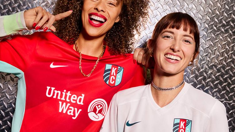
12. Kansas City Current - A design that speaks to the team's pioneering spirit
Kansas City Current's primary jersey for 2024 is a testament to their groundbreaking strides in women's sports, with the design paying homage to the world's first stadium built exclusively for a women's professional sports team.
With the majestic Missouri River as a backdrop, the jersey's design echoes the rivers depicted on the club's crest, which converge and gain strength. The signature red and rising teal stripes encapsulate the essence of the "Teal Rising" mantra, symbolising the unstoppable force of the Current.
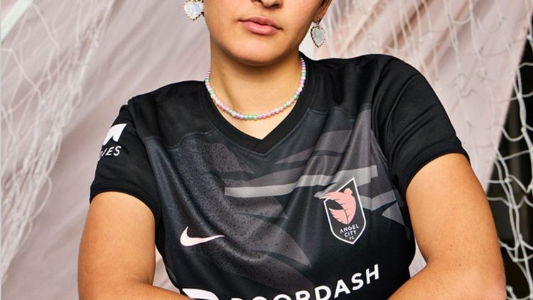
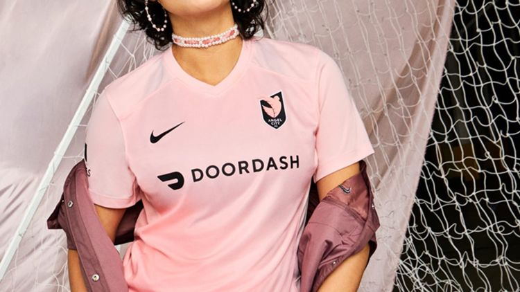
11. Angel City FC - A stunning contrast of themes and colours
Los Angeles' Angel City FC takes flight with the "Moonlight" and "Sol" kits. The primary "Moonlight" jersey is a tapestry of determination, featuring a wing that's broken free from its crest set against a gravelly texture. It’s a potent reminder of the tenacity required to conquer the challenges ahead. Accents of "Sol Rosa" add a vibrant pop against the monochrome backdrop, reflecting the club’s standard pink colourway.
Conversely, the secondary "Sol" kit radiates optimism. It’s a visual celebration of the joy that ACFC and its community embody, basking in the signature sunrise gradient of their crest. Together, these kits masterfully balance the dualities of grit and jubilance, perfectly encapsulating ACFC's ethos.
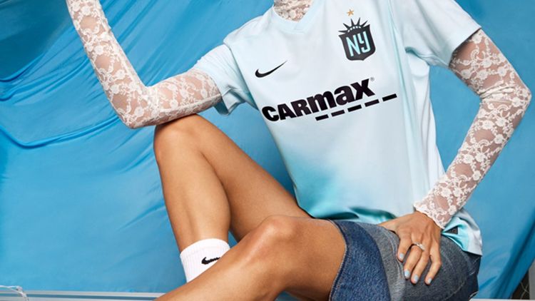
10. NJ/NY Gotham FC - A sleek representation of the city's iconic skyline
Gotham FC's primary kit draws its inspiration from the iconic New York City skyline, with a pattern based on the Statue of Liberty's crown.
The icy blue gradation across the jersey mirrors the city's vibrancy, while the black sash represents the Hudson River, a lifeline between New York and New Jersey. This kit isn't just a garment; it's a beacon of ambition and tenacity, a visual representation of Gotham FC's relentless pursuit of greatness, now marked by a new gold star above their crest, celebrating their status as reigning NWSL Champions.
9. North Carolina Courage - A modern retro design that stands out
The North Carolina Courage's new primary kit marks a striking departure from tradition, with a retro nod to the Triangle region. The jersey employs a graphic triangle pattern, symbolic of the team's dynamic and multi-faceted style of play.
The state's motto, "Be > Seem," subtly integrated into the design, speaks to the authenticity and ambition of the team. The colour palette, a diffusion of reds and blues, reflects a bold step in the club's aesthetic evolution, while also staying true to its core values.
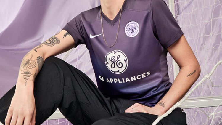
8. Racing Louisville FC - A clever blend of local culture and sport
Racing Louisville FC's "The Winner's Circle" kit is a stylish tribute to Louisville's storied equestrian legacy. The lavender diamond pattern with an argyle mint overlay on the jersey is a modern interpretation of traditional horse racing silks.
The fleur-de-lis, a nod to the city's French heritage, is cleverly incorporated into the design, strengthening the bond between the club and its community. This kit reflects a celebration of strength that transcends size, much like the spirited jockeys of the sport that inspires it.

7. Washington Spirit - A new era represented in a bold and elegant design
The Washington Spirit's "Blackout" primary kit is a bold statement of change and evolution under the leadership of Michele Kang.
The tonal grey and black pattern is an ode to the area's architectural heritage, while the "Spotlight" secondary kit shines a light on the club's pioneering spirit. This design is a preview of the club's future trajectory, aspiring to lead and inspire within and beyond the sports world.

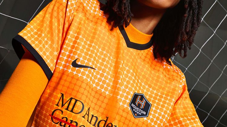
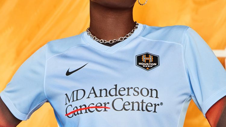
6. Houston Dash - A galactic nod to Houston's space heritage
Celebrating a decade of football, the Houston Dash's "10th Anniversary" kit is a stellar tribute to the city's pioneering spirit in space exploration. Featuring a pattern of multi-coloured stars against a vibrant orange, the jersey carries a street art-inspired graphic that boldly declares Houston's identity as a space city.
The secondary "Space City Blue" continues the celestial theme, promising to carry the team's aspirations to the stars.
5. Chicago Red Stars - A vibrant representation of the city's diverse tapestry
The Chicago Red Stars' 2024 kit is a visual symphony, a harmonious blend of the diverse cultures and communities that make up the Windy City.
The primary jersey radiates outward from the club's heart, with nine different stripe patterns symbolising the unity of Chicago's neighbourhoods. The outer pride adorned with four stars, reminiscent of the city's flag, stands as a tribute to Chicago's storied history, embodying resilience and strength.

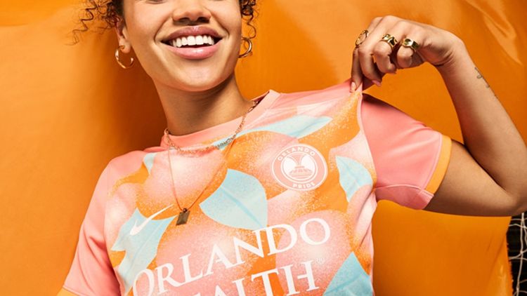
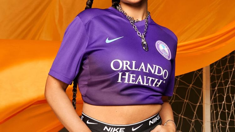
4. Orlando Pride - A refreshing and bold design that captures the region's essence
Orlando Pride's 2024 "Citrus" kit is a vibrant homage to Central Florida's iconic citrus industry. The innovative colour palette of dreamy oranges and lush greens introduces a fresh and audacious visual identity to the field. The design intricacies, drawing from citrus crate packaging, infuse a sense of local heritage and pride into the jersey. This design is not merely about appearance; it's a celebration of the region's history and the team's connection to its roots.
The secondary "Phoenix" kit symbolises rebirth and vibrant new beginnings, echoing the team's unwavering spirit. The design is as refreshing as it is bold.
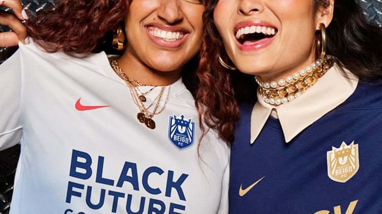
3. Seattle Reign FC - A majestic return to the club's roots with a modern twist
The Seattle Reign FC's kit for 2024 is an embodiment of their royal heritage, with the return of the club's original name and identity.
The primary jersey, adorned with gold accents against a blackened blue, symbolises a new golden era of soccer in Seattle. The "Reign Returns" narrative is not just a nod to the past but a declaration of a future filled with potential and aspirations. It's more than a kit; it's a crown worn with every match.
2. San Diego Wave FC - A bright and energetic tribute to the city's sunsets
San Diego Wave FC's primary kit is a dynamic portrayal of the city's legendary sunsets. The design captures the essence of San Diego's shared horizons, where the ocean kisses the sky, symbolising unity and inclusivity.
The vivid orange, pink, and turquoise patterns exude the joy and energy characteristic of "America's Finest City." The hand-drawn "Wave FC" outer pride is a personal touch that adds authenticity to the kit's narrative. This kit doesn’t just stand out, it shines.

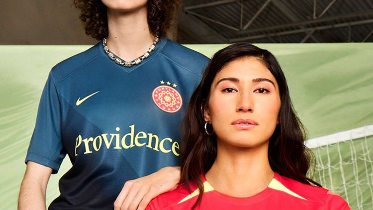
1. Portland Thorns FC - Aggressive and stylish, just like the team
Portland Thorns FC's "Forever Thorn" kit is a bold declaration of intent for the 2024 season. The geometric thorn patterns signify readiness and respect, echoing the team's fierce competitive spirit. A new colour palette, inspired by Portland's moniker, the City of Roses, adorns the jersey, symbolising the team's deep connection with its city.
The "PDX" outer pride, constructed from thorns, is a proud nod to the team's home, etched on the fabric of the jersey itself. It’s a kit that doesn’t just make a statement, it screams Portland pride.
The NWSL's collaboration with Nike for the 2024 season kits is more than a fashion statement; it's a celebration of each club's unique identity and connection with their community. Through thoughtful design and innovative technology, these kits embody the spirit of the teams they represent and the passion of the fans who wear them.
What's your ranking? Share your thoughts and show support for your favourite NWSL team as they gear up for an exciting new season.
Let the games begin!
Watch Women's Football for free on DAZN. Register Now

