Error code: %{errorCode}
Ranking the 24 National League home shirts for the 2025-26 campaign
Today sees the start of a brand-new National League season as DAZN begins its coverage by showing all eleven games live across the afternoon.
The stage is set for it to be another action-packed campaign, but what will each team be wearing for 2025-26?
DAZN News ranks all 24 of the new National League home shirts, so which design has bagged top spot?

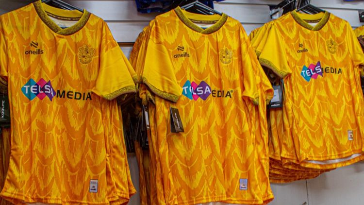
24 - Sutton United
By default, Sutton are ranked lowest, but only because they haven't released a new home shirt for the 2025-26 season. The Surrey side are sticking with their threads from last year, so nothing against the design - although there's a lot to say about that pattern - but you don't qualify for this ranking, lads.
23 - Boston United
We're going in hard from the off with an old kit argument of smart and simple or simply just plain dull?
Umbro do seem to toe that line more than most, and for the majority of the time it's down to their sleek and traditional design. However, we're sorry, Boston, but this shirt falls on the other side of the debate. The colours are nice, but it's just a gold shirt with black trimming, and that's all there is to say.
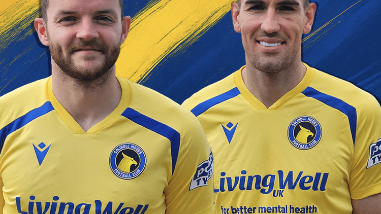
22 - Solihull Moors
Sticking with the underwhelm theme, there's not too much to be said of Solihull Moors' new kit either.
The yellow effort from Macron screams catalogue kit a little too hard and feels quite inspired compared to the rest of the division this season. Even if yellow and royal blue still make a classic combination.
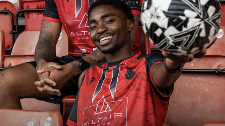
21 - Altrincham
From one end of the scale to the other, the one thing you can say positively about Altricham's new shirt is that it's not dull - unfortunately, there isn't more postitive things to say. There's just a bit too much going on with this Puma shirt. There are white stripes, black trimming, a big red square for the sponsor and then an additional black fade going up the middle, which looks like an ink smudge.
Apparently it's a nod to their 1980s kit with some modern twists, but I think the twists were just too many.
20 - Boreham Wood
Back to the boring theme now and Boreham Wood's new kit from Puma. It's a white shirt, with a simple round colour and twinned with white shorts and socks.
The only reason it hasn't fallen lower down the rankings is thanks to the small attempt to make the shirt unique with silver-looking panels down the sides. Somehow, it lifts the design just enough to make it interesting.
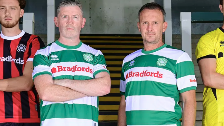
19 - Yeovil Town
As someone who has a soft spot for hooped shirts (wink, wink to Loftus Road), there's nothing really wrong with Yeovil's latest shirt, it just feels like a Yeovil shirt we've seen countless times before.
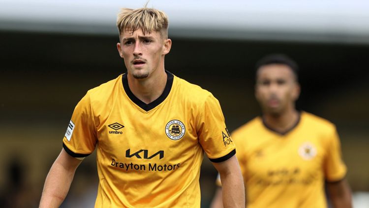
Maybe that's down to the very simple design from Errea, with a simple round collar. The red sponsor also looks entirely out of keeping with the club's traditional colour scheme.
18 - Tamworth
This kit is almost there, but it's ruined by some odd design choices that relegate it right down the rankings. The baseplate is good and the colours complement each other, but why the need for the railings on either side of the sponsor is an odd move.
Likewise is the decision to blackout the badge. It looks like it's been stamped on with those ink things that kids play with at craft time.
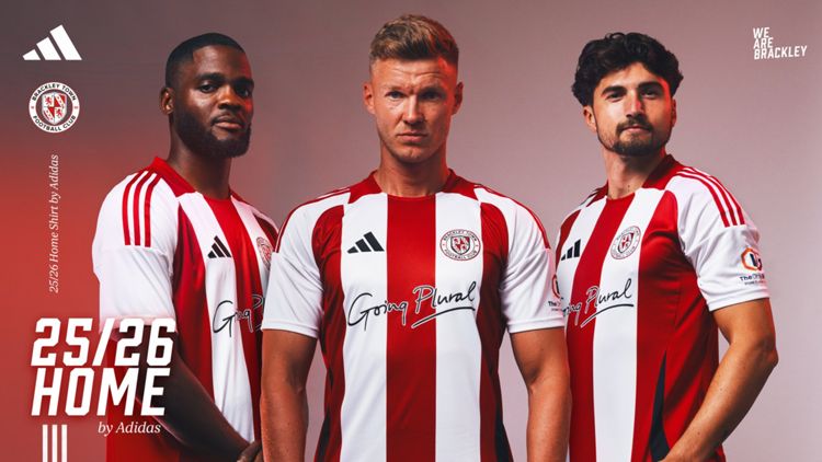
17 - Brackley
Into the world of Adidas and templates we go. There's nothing particularly wrong with this shirt, it's just there are so many red and white striped teams that it's always hard to look in anyway original, and this kit looks anything but.
The red patches around the collar does seem to lift it from its fellow red and white striped brothers, but it just doesn't feel as fresh as the promo wants you to think it does. Also, what exactly is 'Going Plural'?
16 - Aldershot
I've stared at this kit a number of times now, and I still can't work out if a) I like it, and b) what that pattern is trying to be in the centre of the shirt. It looks as though it may be playing on the dragon in the Shots badge, but I'm still not sure.
There's also an unnecessary clash with the sponsor in the middle of the shirt, which makes the whole thing messier than it really should be.
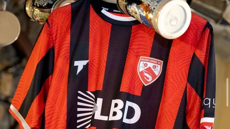
15 - Morecombe
Fingers crossed we actually see this kit in action, what with the unfortunate state that Morecombe find themselves in ahead of the new season.
It's a decent-looking shirt too, made by Terrace Teamwear, the design features elements inspired by the leaves of Morcombe Bay, and it's already been a big hit with the fans.
14 - Halifax Town
Another adidas kit that feels too familiar, like these fabric patterns have been used previously and without any actual explanation.
The blue is striking and the badge being full colour is always a crowd winner, too. It looks good, but without being great. Maybe if the pattern was also incorporated into the shorts, we'd be looking at a top ten finish instead.
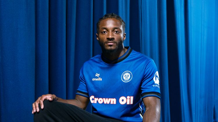
13 - Braintree Town
There's something so pleasing about a shirt that has two colours that just complement each other so well, even if it is orange and blue.
Even the colour and cuffs marry the two colours well. It's not winning any contests, but it's the best way to make a classic quartered shirt work. There's also an element of Harchester United about it, which pleases this writer immensely.
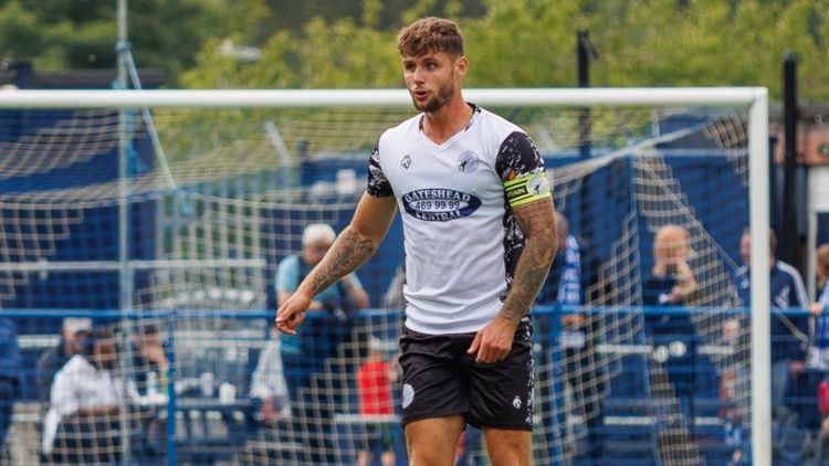
12 - Gateshead
A shirt that, if you ripped off the side panels, would be looking at the other end of the ranking, but Hope and Glory's bespoke detailing down the sides and around the collar have saved the day.
It may look like a pattern akin to TV interference (that's from the non-digital age, kids), but it actually includes a nod to the Angel of the North. Excellent.
11- Rochdale
Now this is when simplicity works. Essentially, this is just a blue shirt with black trim, but it's how the trim is used that makes all the difference.
The colour, especially with its white detailing, really gives the shirt a classy look, which is only let down by the red outline on the sponsor. There's no place for red on this sleek number.
10 - York City
Everyone loves a touch of Hummel, right? Denmark, Southampton and Coventry in the 80s and this York shirt is right up there with some of the company's best.
The classic chevrons adorn the shoulders, the collar is made up of a nice double trim, and there's a fabric pattern across the shirt that pays homage to the city's Viking past. A real eye-catcher from the Danish brand.
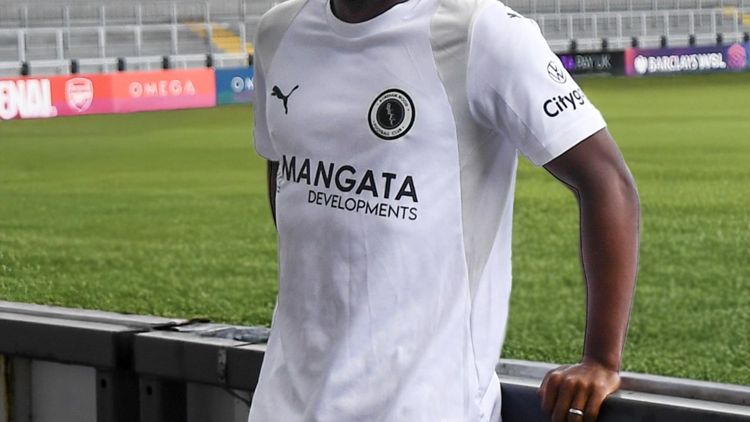
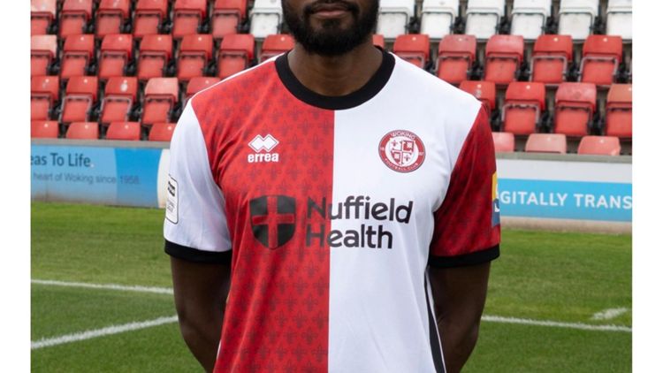
9 - Woking
If this had been a simple red and white halved shirt, it probably wouldn't have even been able to look at the top ten, but Errea's added element to Woking's new home shirt has made all the difference.
Taking an element from the club badge and then using it to emboss into the fabric pattern is very effective and especially as they've only done it on the red parts of the shirt. Simple, but very well done.
8 - Eastleigh
Sometimes it's hard to work out what you like, which makes kits so fun and subjective, and this is one of those instances. A lot is going on within the design, but as it's kept to two colours, it all seems to marry together rather well.
It's almost as if Errea came up with two kits, couldn't make up their mind, so they just meshed them together. And it worked!
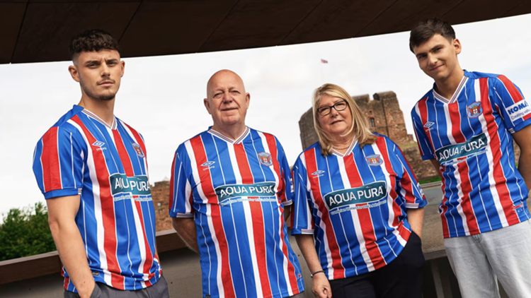
7 - Carlisle United
Umbro rarely go wrong and even though there are a lot of colours here, and some different thickness of stripes, it all comes together like only a classic Umbro kit can.
They've even overcome a murky coloured sponsor to produce a winner for Carlisle. It does give off some Aquafresh vibes, but not enough to spoil it for us.
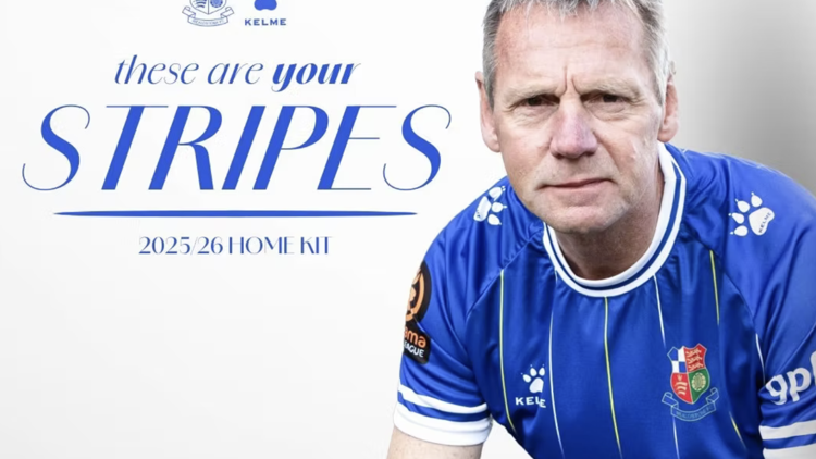
6 - Wealdstone
Adding some Spanish flavour to the division is Kelme and their kit for Wealdstone. They've given the Stones a smart-looking pinstripe design set on a deep blue base, trimmed with white collar and cuffs.
They also get bonus points for their paw print logo on the shoulders and for using local legend Stuart Pearce in their launch campaign.
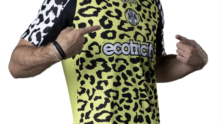
5 - Forest Green Rovers
A kit bound to split the community as Forest Green makes a real statement with a design that Mel B would have rocked in the Spice Girls heyday. Yes, it's animal print, yes, it's leopard print and yes, it's leopard print in two different colours.
It shouldn't work, but somehow, just like Robbie Savage's hair, you can't keep your eyes off it.
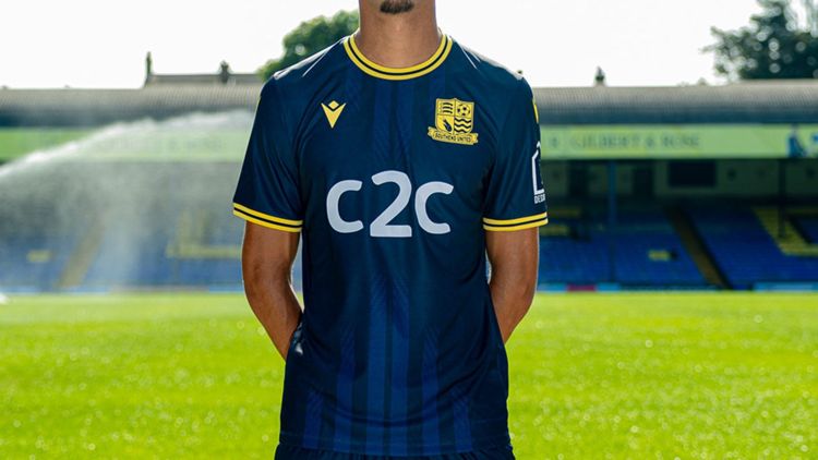
4 - Southend United
Is it because yellow and navy just work? Or is it because the kit reminds of a mid-90s Wimbledon number, and all that it's missing is Elonex as its sponsor? We're not sure, but it's a chef kiss of a kit for sure.
Even the full yellow badge adds a complementary element to the Macron design, and if you look closely, there are seven dark stripes running down its front – one for each decade they've been playing matches at Roots Hall.
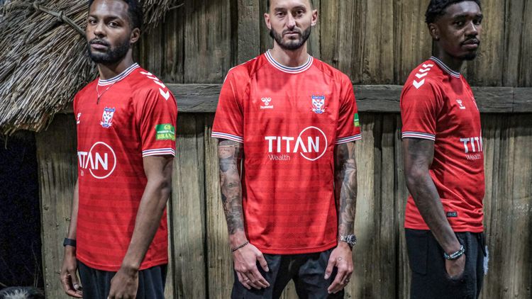
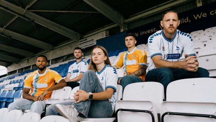
3 - Hartlepool United
You may remember Meyba from the Barcelona kits of the 1990s, but they've made a bit of a splash this year in the National League, and it's been to great effect.
This Hartlepool shirt is a nod to the classic 2003-04 home design but given a twist with Meyba's tally-like shoulder graphic and fizzy-looking pinstripes. It's a kit that really pops (as does the change kit, too).
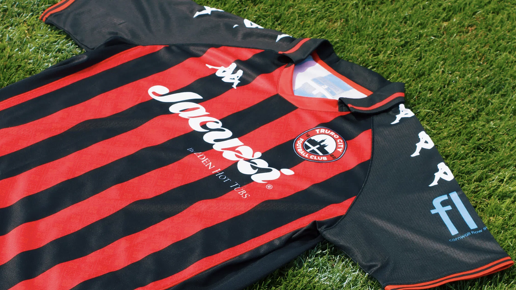
2 - Truro City
Give us Kappa, give us a polo collar and we are putty in your hands. Truro City celebrate their National League promotion with a shirt that wouldn't look out of place on Gazetta Dello Sport.
The red and black give off AC Milan vibes, and there's no doubt that the Cornish club will be the coolest-looking team in the National League this season. Balissimo.
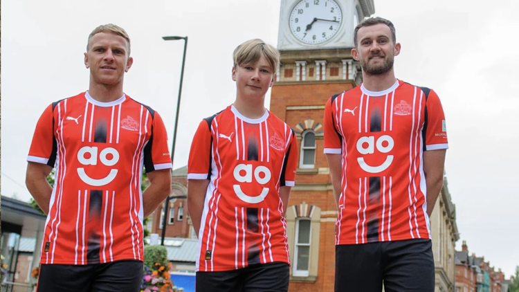
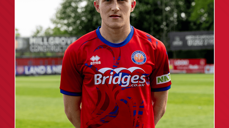
1 - Scunthorpe United
How could anything beat a 90s Serie A-looking design I hear you ask?
Well, we've gone gimmicky for the top pick, because sometimes complete originality that cleverly connects the town and club's identity is too good not to acknowledge.
Scunny are nicknamed the Irons and Meyba - our newest favourite kit supplier - have paid homage to that name by incorporating chain links down the shirt in a pinstripe style design. That genius touch, combined with a pleasing combo of blue and maroon, makes this our favourite shirt of 2025-26.
 Watch National League football live exclusively on DAZN
You can watch the 2025-26 season with a National League TV DAZN subscription - and sign up before August 31 with a new season special offer!
Every game in the National League, and selected matches in National League North and National League South, is available on DAZN. That's over 600 games to watch live or on demand catch-up, all in one place.
NLTV on DAZN is available on any device, including Smart TV’s, mobile devices, tablets, streaming devices, games consoles, and, for viewers in the UK, your Sky box.
For more information and to sign up, head here now.
| Plan | What is included | Price |
| Weekly Pass |
| £12.99 - special offer price! |
| Monthly Flex |
| £19.99 per month |
